Find the blocks that run hottest before the cooling budget is set.
Heat Exposure Mapping reads surface temperature and built surfaces for the blocks in your pilot district, joins them to the population data you supply, and ranks the blocks. The next cool space and the next row of street trees can then go where the heat and the residents who need help are.
- coolerhotter
- ward boundary
- GSD
- 10–30 m (Wide)
- Cadence
- Seasonal
- Platform
- Wide-swath satellite
- Spectral
- Multispectral with thermal band
- Reported by
- Block or grid cell
Where the ward score hides the hot blocks
Most council heat plans rest on a heat vulnerability index that was built once, by ward or by LSOA. A consultant or a university partner often made it, and the public health team has worked from it since. Beside it sit a tree canopy map and the list of libraries, leisure centres and halls that open as cool spaces when a heat-health alert goes out. It is a fair way to say which parts of the borough need attention.
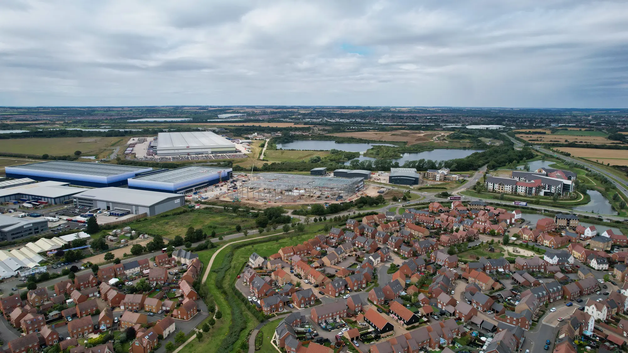
The trouble starts when a member asks a narrower question. Where does the next cool space go? Which streets get trees in this winter's planting round? The planner answers from an area score. Inside one ward, a retail park and a run of flat-roofed units can run hotter than the terraces around them, and an area score averages that away.
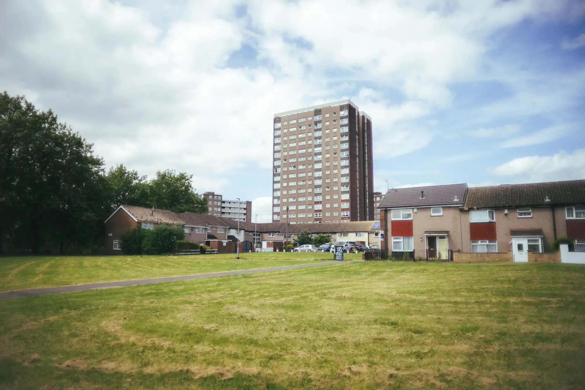
So the new cool space opens in a building the council already owns, which may be a long walk from the people who need it.
A thermal pass over the summer shows how hot each block gets, and the demographic layer you already hold says who lives there. Put together they give the planner a ranked list of blocks to take into the room. Your index and your heat plan stay as they are.
What comes back
Each pilot is one seasonal pass over the district you choose. The files open in the GIS your team already runs.
2.1Surface-temperature overlay
GeoPackage or shapefile
Land surface temperature by block for the summer, in °C, from a thermal pass. Load it under your ward or LSOA boundaries in ArcGIS or QGIS and the hot blocks stand out against the cooler ones.
2.2Built-surface layer
GeoPackage or shapefile
A coarse class for each block (dense built-up, low-rise, open paved, vegetated), which says why a block holds heat. At this resolution it describes what a block is made of. Individual buildings and roof types are out of reach.
2.3Vulnerability index
GeoPackage and CSV
Block temperature joined to the demographic layer you supply, ranked from most to least exposed. The CSV carries block ID, ward, temperature and the demographic field you chose, sorted so the top of the list is where heat and vulnerable residents coincide. It is a relative ranking for planning. It forecasts nothing and says nothing about anyone's health.
How it works
3.1Boundary and population data in
Send the borough or district boundary, your ward, LSOA or block layer and the demographic fields you want joined (older residents, people living alone, deprivation, whatever your team already counts). Population figures come from you.
3.2Summer pass
We pull the clearest multispectral and thermal imagery over your boundary for the summer you are planning for.
3.3Classification
Each block gets a surface temperature and a built-surface class. Where no usable pass exists, the block is marked and left empty.
3.4Overlay delivered
The temperature and built-surface layers, plus the ranked block list with your demographic layer joined. We talk you through the top of the list when it lands.
Ahead of the heat plan review
Run it before the plan is reviewed and the cooling money is argued. Take the top of the ranked list to your colleagues in parks and planning, then walk the blocks to decide what suits each one: a cool space, street trees, or something else. Where a ward score says "this ward", the block list says which blocks inside it.
Limits
Each limit sits as a note beside the section it qualifies, and all are collected here.
Block level, not building level
At 10–30 m a pixel is wider than most houses. A block's temperature is an average over the ground, roofs and trees in it. The layer cannot say which rooftop is hot or which flat has no cooling.
Thermal is coarser than the rest
The thermal band is usually coarser than the optical bands, so a block's temperature can be smoothed across a wider patch than the block itself. Read it as a neighbourhood-scale pattern, and treat single streets with care.
Surface temperature, not air temperature
The thermal band measures how hot surfaces are from above. It is not the air temperature people feel, and it says nothing about conditions indoors.
A cloud-free pass is needed
The thermal band cannot see through cloud, same as optical imagery. A cloudy stretch can delay the pass or leave a block without a usable reading, and we mark it instead of filling it in.
Seasonal, not live
One pass per summer, timed to your plan. It is a daytime snapshot of clear-sky conditions. It is not continuous monitoring, a heat-health alert or an overnight reading.
Current conditions, not a forecast
The ranking describes the summer just imaged. It does not predict how hot a future summer will be or how many people will fall ill.
Your demography, your data
The index is only as good as the population layer you join. We do not invent or fill gaps in it.
Who it's for
For
- Environmental health planners and climate-and-health officers in council public health teams who decide where cool spaces and street trees go
- Teams that already hold a ward or LSOA vulnerability index and want a finer cut inside it
- Public health teams reviewing a heat plan ahead of summer
Not for
- Heat-health alerts or day-ahead forecasts
- Illness or mortality prediction for individual people or households
- Rooftop or building audits, such as which block of flats lacks cooling
- Regional or national screening where a borough is not the unit
Questions before a pilot
Is this a forecast?
No. It reads current conditions for the summer just imaged. Future heat events are outside it.
What does 10–30 m show?
Surface temperature and a coarse built-surface class by block. Individual buildings and rooftops do not show.
Does it replace our heat vulnerability index?
No. It adds a finer cut. The ward or LSOA index and your heat plan stay as they are, and the block list sits beside them.
Where does the demographic data come from?
From you. We join the layer you send to the temperature read and do not supply or estimate population figures.
How often does it update?
Once per summer, timed to the plan you are working on. There is no monthly or continuous refresh.
Does thermal see through cloud?
No. It needs a cloud-free pass, so a cloudy spell can delay the pass or leave a block without a reading.
How do we check it against what we know?
Pick a district where you already know which blocks run hot, and keep that knowledge to yourself. When the delivery lands, compare our ranking with yours and decide whether it is good enough to plan with.
Will it load into our GIS?
It comes as a GeoPackage or shapefile plus a CSV, keyed to your block, ward or LSOA IDs. Anything that reads a GIS layer or a spreadsheet can take it. We do not write into your systems.
Who owns the results and the imagery?
Ownership and licence terms for the deliverables and the underlying imagery go into the pilot agreement before anything is ordered. If your legal team needs to review them, ask early.
How is a pilot bought and priced?
The quote depends on the size of the area and the imagery used, and we price it for your pilot district. Tell us how the council buys services and we will scope the pilot to fit.
Target the next cooling investment by block.
Tell us which district you would put in the pilot and when the heat plan is reviewed. We will say whether the imagery calendar can meet it.
Start a pilot